Here’s the transcript
Website design is all about form and functions. Kind of like a
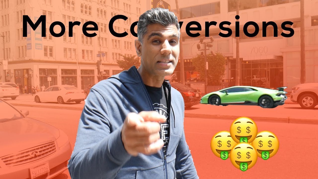
green Lamborghini, a lime green Lamborghini, of all things. Is that
more form or is that more fun? I don’t know. Do you want your site
to be like a Lambo? Do you want it to be like a Ferrari?
Do you want it to be like a MercedesBenz or pre you? So in this
video, we’re going to teach you about how UX and UI design can
help drive more conversions. I’m going to code and build up a page. I’m going
to show you a before page and an after page.
UX stands for User Experience and UI stands for User Interface.
We’re going to show how UI and UX can help drive more conversions for
your business. When figuring out the information architecture of your website,
just consider that it’s like a conversational dialogue. What do you guys do and
who else uses your company and how can I use your company? How has your
company been validated or how do I sign up? There’s a whole process that people
go through in their minds when they’re learning about a new business. Same applies to
the website design and the overall user interface. The first thing that we do is
show some of the features, some of the benefits, and then we get directly into
validation of social proof. One of the most important things on your
site is a clear call to action. Always have the last panel of your website
be a strong call to action. You have two ideas for homepage.
Try to get both of those done, and then AB test to figure out which
one converts better tools like Optimizely and even Google Optimize,
which is Free, which will help you a b test your landing pages based on
some specific conversion rate. So one of the things that I wanted to take you
through right now is actually the full rehabal process of building up a page.
One of the decisions that we made was instead of completely rehauling our
whole website, we decided to do an Iterative process.
Starting with the homepage, we started to deploy pages. The reason why we
did this is so that we can slowly migrate over to our new website.
Iterate our site, Page by page, just so that we could get it done faster,
get more feedback, and make more improvements. Our features page is
one of our older pages. The funniest thing about this page thumbnail graphic
of me with my eyes completely closed. We never got around
to customizing the thumbnail graphic. It’s actually the first frame of
the video, so it kind of looks like I’m meditating. This page is a little
bit flat. It’s some of our older colors. The spacing is a little bit off.
There’s not sort of a clear distinction between modules. So we’re going to give
you a before and after of updating this page.
I’m actually going to get into the code, but that doesn’t mean that you need
to do it this way. In this day and age, there’s so many landing page
builders. There’s so many website builders. WordPress is a great resource if you’re
a small business. There are companies like Wix or Squarespace.
As I’m building this page up, I’m also testing the page load time, and I’m
seeing that the page actually loads really quick because all the code is minified and
it’s streamlined. We’re using Edge caching for our file host. Fast page
load time will really help you with your SEO. Google gives higher rankings to
pages that are optimized for mobile and fast load speed.
So I just finished building up the new Dub Features page,
which I’m kind of proud of. Got a really strong header message on top,
really punches in with some key bullets of what we are. What we offer shows
some of the key distinctions of some of our features, but then also really what
the true benefits are. It’s not about features. It’s about benefits.
What are the problems that your solution can solve for people, and how can
it make their lives easier? How can it make them more money? How can it
save time? How can it alleviate some sort of a pain point? We really pushed
in hard on a lot of the value points and the ways that we
can truly help. There’s lots of screenshots, there’s a dashboard shot,
social proof. There’s an integration section. Of course, it always ends
with a strong call to action. So all of these updates, from the branding
to the UX to the UI, to the information, they’re going to help
people to understand what Dub is and how it can help in their business.
Of course, we’re going to a B tested, and like with anything on the internet,
it’s never done. This is just the beginning process, constantly evolving
machine that we’re going to continue to iterate. So I hope you got some takeaways
from building building your business website. If you have any questions on your website
or your business, throw them below. And we’ll also get to all of them.
If you want more content like this, don’t forget to subscribe to our channels.
Thanks for listening.


